How do you get your Instagram colour palette spot on?

Post summary:
Choosing your brand colours
Which colour palette?
Tips for creating an Instagram colour palette
When marketing yourself on Instagram, your aim is likely to get your targeted audience to click 'follow,' you must catch their attention.
Even if your photos look fantastic in feeds, how do they appear when your audience views your account in the grid view?
It's important to get your Instagram colour palette right as these statistics demonstrate:
1 billion people use Instagram each month
63% of Instagram users log in at least twice a day
200 million users visit at least once business profile
Instagram users spend at least 28 minutes per day on the platform
People are more attracted to brands and will 'follow' them if their social media accounts look outstanding and professional.
Using an Instagram colour palette to ensure your grid feed looks stunning is one tool to use.
But how do you get your Instagram colour palette spot on?
Colour that highlights your brand
What does your brand need to communicate? Which audience are you targeting? You may not know at the start, but you need to have an idea of what your colour psychology is.
No matter what demographic you target – female, youth, or couples. Know that inspiring images do well on Instagram.
Most social media platforms have their own analytics and insights so you can use that data to determine which gender and age groups are following your brands on these platforms, more so if you use Instagram advertising.
Which colour palette do you choose?
To know which palette to use, it is a good idea to consider which colours work best in social media in general.
You want colours that do not turn away your target demographic but match your brand.
Here are the palette types you should aim for when choosing an Instagram colour palette:
Monochromatic color palettes
If one colour truly represents your brand, then a monochromatic colour palette allows you to expand that colour with shades, tones, and hints.
The concept behind using a monochromatic colour palette is that your one true brand colour only subtly changes, using more tones in your Instagram feed.
Analogous colour palettes
Analogous colours are situated in the same section of the colour chart. Depending on which colours you use, you can achieve either a warming brand effect or a cool, crisp fresh one.
Note, though, analogous colours are not ideal for text, as they are too similar, so become 'lost' when read.
Complimentary colour palettes
Opposite colours on the colour ring are called complementary colours and highly contrasting (for instance: blue and orange). When used, complementary colours create an energetic look.
This colour palette must be carefully managed, so it is not too striking on the eye. However, if your brand needs a little more creativity, then a complementary colour palette will suffice.
Triad colour palettes
A triadic colour palette has three colours evenly spaced on the colour ring. The most basic triad palettes are the colours red, blue, and yellow, and the other one is orange, purple, and green.
Because of the dramatic contrast, a triad colour palette is very impactful. Be careful if you do use this type of colour palette, as it rarely works on Instagram.
Compound colour palettes
A compound colour palette is used similar to a triad colour palette in that you choose three colours.
However, unlike a triad colour, where the three colours are strikingly different, a compound colour palette has a vibrant colour with two 'softer' colours adjacent to its complementary colour.
Borrowing slightly from the complementary colour palette, the addition of adjacent colours creates a more exciting colour palette but with less contrast.
Square colour palettes
Much like triad colour palettes, if your brand has four colours and must be striking, then choosing four colours in a square shape of a colour wheel will give a high contrast look.
If this is your choice of colours, then avoid the red-blue-green-yellow axis of colours and vary your 'square' shape beyond that so that you produce a better plethora of colour.
Neutral colour palettes
Neutral colour palettes are worth considering because they look beautiful on Instagram.
Neutral Instagram colour palettes are subtle tones of white, grey, brown, and black, creating a background feel to your images.
While they may not stand out, if you add a splash of colour once in a while, this will immediately stand out and grab the viewers' attention.
Tips for creating an Instagram colour palette
Generating a palette
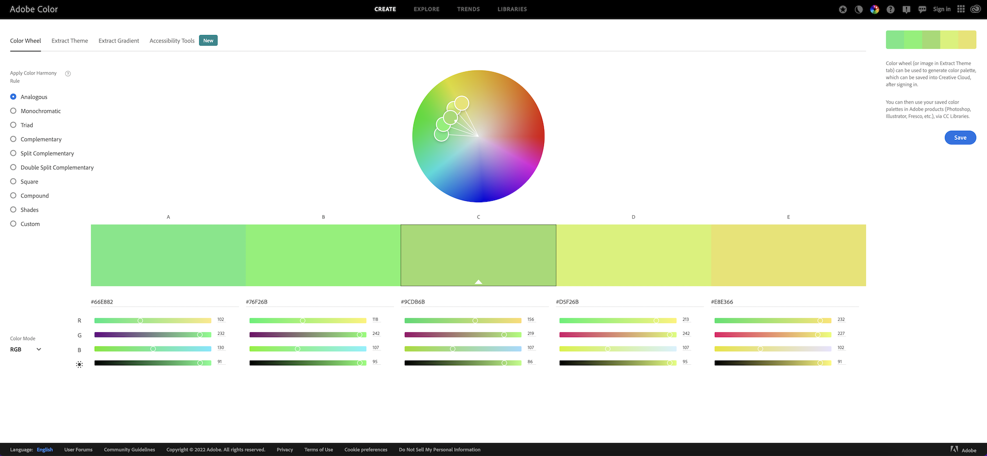
You can use Adobe Color's colour wheel to create possible colour combinations, or you can upload colourful images that you like, and it will dissect the colours and present some possible colour options.
Although this is helpful - it won't entirely satisfy your decision on creating your colour palette, you will still need to have some idea yourself.
Be sure to create an inviting Instagram colour palette that pleases viers yet still matches your brand colours.
Before adding a photo or selecting colours, consider what feeling you are attempting to evoke in your images. In the left-hand menu of Adobe Color you will see the generated options:
Analogous
Monochromatic
Triad
Complimentary
Split Complementary
Double Split Complementary
Square
Compound
Shades
Custom
As you can observe from the screenshot above, the colour generator chooses additional colour options as well, although if the extras do not convey what you want, you'll need to create your own.
You do not have to be a graphic designer to view which colours are more effective. Use colour tools to start with, to get inspiration.
Adobe Color
Apply filters to your colour palette
Instagram filters are a great addition to your images, making sometimes lifeless pics have more purpose. But each filter can negatively distort your image if it does not compliment your Instagram colour palette.
Easy, try uploading a few images to your Instagram and see which ones look best with your new colour palette.
Maybe some bright images may need toning down a bit; darker images may need an injection of colour.
At the time of writing, they have 24 Instagram filters. According to Hubspot, the following are the most popular:
Clarendon
Gingham
Juno
Lark
Mayfair
Sierra
Valencia
Walden
Create a brand book
Making an Instagram brand book is an excellent way to keep your Instagram images uniform when posting. Doing this provides a handy resource on how each image should be created.
You can create a brand book on a PDF, PowerPoint or Word. Whatever works for you.
Include the following:
colour scheme hex codes
your company logo
existing photos that match what you are trying to convey
photos that your company aspires to create
Instagram filters that you will use
a contrasting colour (for sales or to draw attention)
Remember to experiment. Not every filter gives the effect your want on each photo.
Hence it is best to have several options in case you need to bring out the colours of your brand. More natural to add variation if you have a limited Instagram colour palette per se.
Find a test group
If you know who your target demographic is then, you can show your brand book to them and ask for their opinion on whether they resonate with the imagery and colour tone.
Avoid asking friends though, as they will no doubt be kind and tell you what you want to hear rather than what you need to hear.
Furthermore, there are tools where you can receive feedback on your images like Photofeeler. This software is currently free and allows users to obtain feedback on their pictures, whether professional, trustworthy or likeable.
Not only does it use artificial intelligence to score your images, but it also shows them to strangers so they will not be biased like your friends would be.
Be consistent with your Instagram colour palette
Consistency matters more when building an audience on any social media platform, and this includes Instagram.
Getting your Instagram colour palette right will help build an audience who will not only engage with your photos but follow your account.
Instead of generating likes on your one-off Instagram posts, you will begin to attract the audience you need to boost business and engagement. The next step would be to create an Instagram strategy for your business.