The psychology of colours in marketing
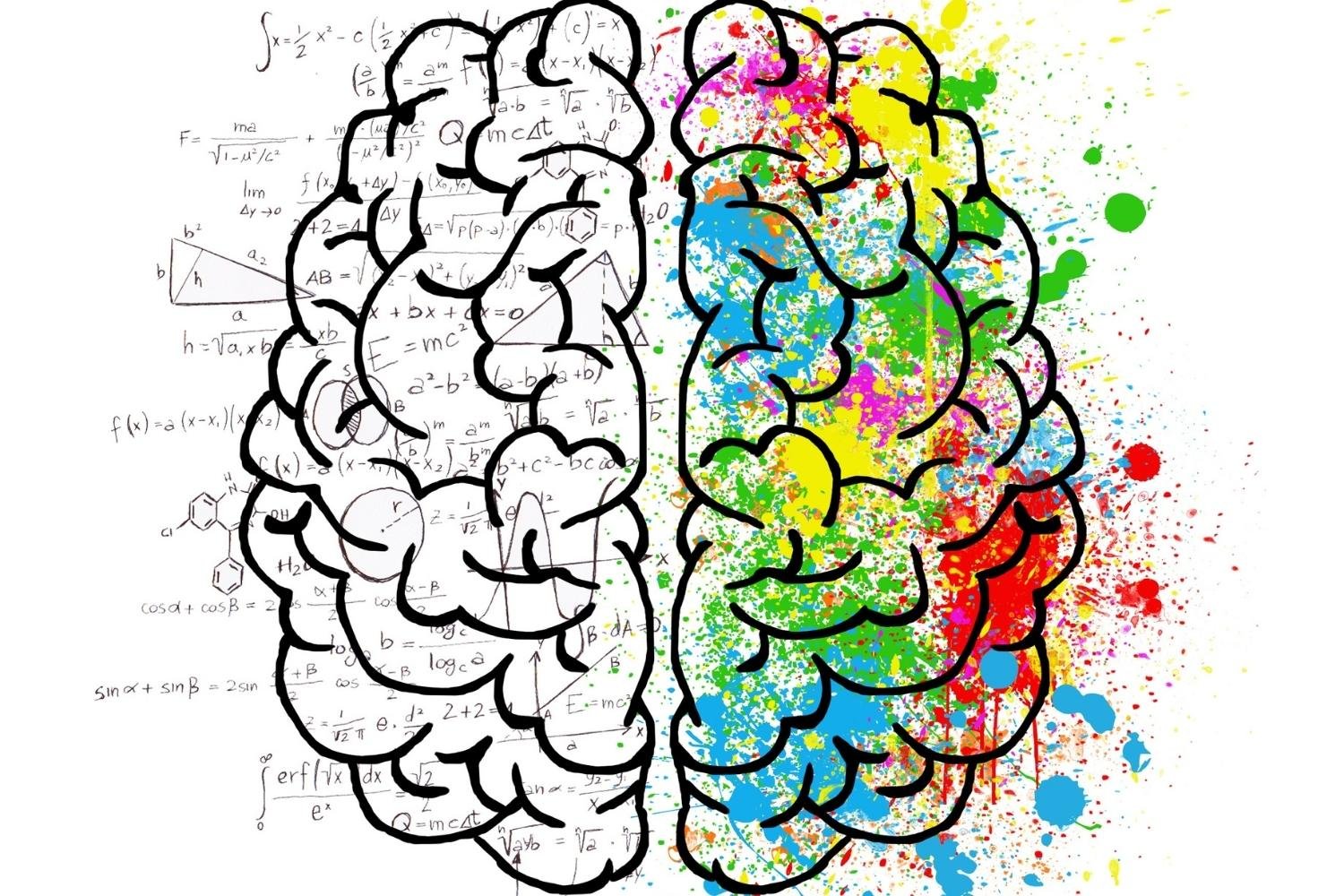
Using colours in marketing, decoration, communication and symbolism is integral to human culture. In our consumer-led and entertainment-related society, the entrepreneur must understand thoroughly both the nature of colour and the way in which it works. Using it well and efficiently will send the consumer the right message about the product.
In today's digital world colour is a key language between the consumer and the seller, it helps to convey mood, emotion and significance. Colour can be used as inspiration, appeal, entertainment, focus and much more.
Below you will find a list of which colours make your viewers/customers feel and how they influence people in general:
Red is emotionally intense and, enhances human metabolism respiration rate and raises blood pressure. It is extremely visible, representing power, passion, high energy, including anger, danger and hunger. It keeps people’s attention and holds it, that is why it is very popular in marketing often being used in fast food chains. It is a great colour for “Click here” and “Buy now” advertisements.
Blue on the other hand, slows metabolism and provides a calming effect. It is associated with water and air, meaning intelligence, loyalty, confidence and trust. In colour marketing blue is widely used for promoting such products and services as water purification filters, air conditioners, airlines, mineral water. When using blue you should keep in mind that it suggest precision, security and trust when promoting high-tech products.
Green is the colour of nature, which brings out emotions as harmony, freshness, fertility and growth. It also has a healing power (no wonder it is widely used in hospitals), suggesting stability and endurance and lends customers a pleasing feeling. In advertising this colour conveys safety when advertising medical products.
Darker green is commonly used for advertising in the financial world - specifically money and banking.
Purple is usually associated with royalty and respect. It is a very rare color in nature. According to surveys 75% of young children prefer purple than any other colour. It stimulates creativity and problem solving in the brain. In advertising it’s widely used for beauty and anti-aging products, children's clothing or representing a creative, imaginative brand.
Orange and yellow increases optimism, but do not overuse it, because yellow is a commanding and powerful colour. By using it you command audience’s attention by letting them know that you are confident in your abilities. Orange, on the other hand is more fun and cool, making customers feel like they are dealing with a good and powerful company.
Black symbolises strength, power, stability and authority, but in excess it can be intimidating and unfriendly.
Grey is often associated with practicality and solidarity. It is quite neutral, but also implies reliability and security.
And finally, white offers purity, safety and cleanliness. In advertising this colour suits if you want to suggest simplicity in high end solutions. It is very suitable for charitable organisations, particularly with doctors and sterility. Also widely used for products that suggest low weight, low fat food and dairy products.
Make sure you choose the right colour for your business and understand the colour meaning behind it!