

Updated 4 November 2026. First published in 2020.
Post summary
Choosing your brand colours
Which colour palette?
Tips for creating an Instagram colour palette
When you market yourself on Instagram, your aim is to get your target audience to tap "follow". To do that, you need to catch their attention.
Your photos may look fantastic in the feed. However, how do they look when someone opens your profile and sees them all together in the grid?
Getting your Instagram colour palette right matters, as these Instagram statistics show.
Instagram has 3 billion monthly active users
80% of Instagram users follow at least one business account
Reels now take up 46% of the time people spend in the app
People are more likely to follow a brand when its account looks polished and professional. A consistent Instagram colour palette is one of the simplest ways to make your grid look that way.
So how do you get your Instagram colour palette spot on?
Colour that highlights your brand
What does your brand need to communicate? Which audience are you targeting? You may not know everything at the start. However, you need an idea of what colour psychology says about your brand, and how colour meanings change from country to country if you sell abroad.
Whatever your audience, inspiring images do well on Instagram.
Instagram's own Insights show you which age groups, genders and locations follow your account, so you can check who you're really reaching. You get even more detail if you use Instagram advertising.
Which colour palette do you choose?
To choose a palette, think about which colours work well on social media in general. You want colours that match your brand without turning away your target audience.
Here are the palette types to consider for your Instagram colour palette.
| Palette | Example | What it is | Best for |
|---|---|---|---|
| Monochromatic | Shades and tints of one colour | Brands with one strong colour. The easiest to keep consistent. | |
| Analogous | Colours next to each other on the colour wheel | A calm, harmonious feed, warm or cool | |
| Complementary | Two colours opposite each other | An energetic look with strong contrast | |
| Triad | Three colours evenly spaced | Bold, playful brands. The hardest to balance. | |
| Compound | One vibrant colour with two softer colours beside its opposite | Interest without too much contrast | |
| Square | Four colours evenly spaced | Brands that already use four colours | |
| Neutral | Whites, greys, browns and black | A clean, minimal feed where one splash of colour stands out |
Monochromatic colour palettes
If one colour truly represents your brand, a monochromatic colour palette lets you expand it with shades, tones and tints. Your one true brand colour changes only subtly from post to post.
Analogous colour palettes
Analogous colours sit in the same section of the colour wheel. Depending on which you choose, you can create a warm brand feel or a cool, crisp and fresh one.
Note, though, that analogous colours aren't ideal for text on images. They're too similar, so words get lost.
Complementary colour palettes
Colours opposite each other on the colour wheel are called complementary colours, such as blue and orange. They contrast strongly and create an energetic look.
This palette needs careful handling so it isn't too harsh on the eye. A useful rule of thumb is to use roughly 60% of one colour, 30% of its opposite and 10% neutral. If your brand needs a little more creativity, a complementary palette could be the answer.
Triad colour palettes
A triadic colour palette uses three colours evenly spaced on the colour wheel. The most basic triads are red, blue and yellow, or orange, purple and green.
Because of the dramatic contrast, a triad palette is very striking. However, be careful, as it rarely works well across a whole Instagram grid.
Compound colour palettes
Like a triad, a compound colour palette uses three colours. However, rather than three strikingly different colours, it pairs one vibrant colour with two softer colours that sit either side of its complementary colour.
Borrowing from the complementary palette, this creates an interesting palette with less contrast.
Square colour palettes
If your brand has four colours and needs to be striking, choose four colours evenly spaced around the colour wheel in a square. This gives a high-contrast look.
If you go this way, avoid the obvious red, blue, green and yellow combination, and rotate your square to find a more interesting mix.
Neutral colour palettes
Neutral colour palettes are worth considering because they look beautiful on Instagram. They use subtle tones of white, grey, brown and black, which let your images speak for themselves.
A neutral grid may not stand out on its own. However, add a splash of colour now and then and it will immediately grab your followers' attention.
Tips for creating an Instagram colour palette
Generate a palette
You can use Adobe Color's colour wheel to create colour combinations, or upload images you like and it will pull out their colours and suggest palettes. It covers all the palette types above, plus split complementary, double split complementary, shades and custom palettes.
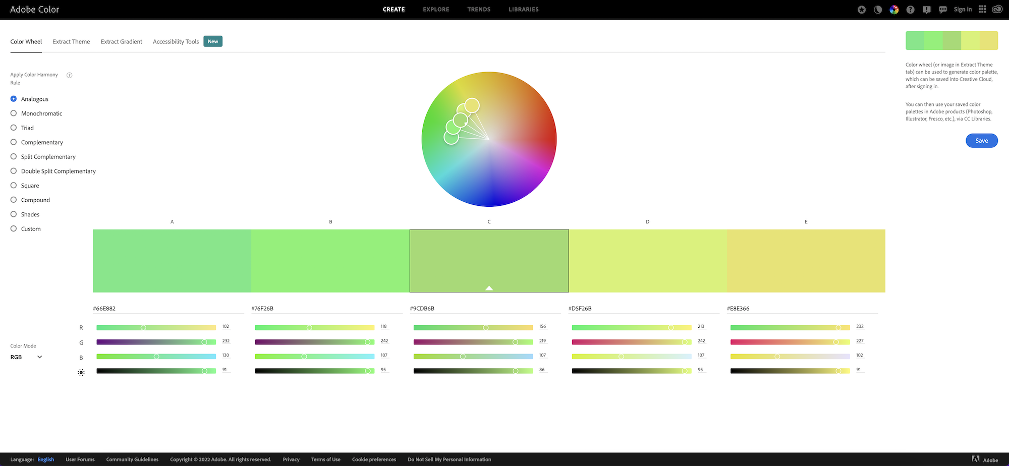
Adobe Color
Other free tools are worth trying too. Coolors generates palettes in seconds and gives you the hex codes, and Canva's colour palette generator builds a palette from any photo you upload.
These tools are a great starting point. However, they won't make the decision for you, so you'll still need your own idea of how you want your brand to feel. Before choosing colours, think about the feeling you want your images to create. You don't need to be a graphic designer to see which colours work. Use the tools for inspiration.
Keep your palette small. Four to six colours is plenty, such as a light neutral, a dark colour for text, your main brand colour and one or two accents.
Check your colours are readable
If you put text on your images, Reels covers or Stories, make sure it stands out from the background. The Web Content Accessibility Guidelines recommend a contrast ratio of at least 4.5:1 for normal text. Free contrast checkers will tell you whether your colour pairs pass, and it helps everyone read your posts on a small screen, not just people with low vision.
Think about colour blindness too. Red-green colour vision deficiency affects about one in 12 men and one in 200 women. Don't rely on red against green alone to make a point, such as a sale price or a before and after. Add a label, an icon or a difference in brightness as well.
Apply filters and edits that suit your palette
Instagram's built-in filters and editing tools can give lifeless photos more purpose. However, a filter can also distort your colours if it doesn't suit your Instagram colour palette.
Instagram still offers its classic set of photo filters on the editing screen. According to SocialRails, these include the following.
Clarendon, Juno, Gingham and Lark
Valencia, Ludwig, Amaro and Rise
Aden, Moon, Willow and Stinson
X-Pro II, Lo-Fi, Kelvin and Crema
Perpetua, Mayfair and Hudson
Moon and Willow are black and white, so they suit neutral palettes. Clarendon and Juno brighten and boost colour, which can help with more vivid palettes. HubSpot's guide to the most popular Instagram filters, based on Canva's analysis of more than a million photos, puts Clarendon, Gingham, Juno, Lark, Mayfair, Sierra, Valencia and Walden at the top.
Try a few images with different filters and see which look best with your palette. Some bright images may need toning down, while darker ones may need an injection of colour. If you edit in an app such as Lightroom, save your settings as a preset so every photo gets the same treatment.
Make mixed photos match
Your photos won't always come from the same shoot. Product shots, phone snaps, customer photos and stock images can all end up in one grid. A light colour overlay in one of your brand colours, or a duotone effect using two of them, pulls different photos together so they look like they belong. Keep it subtle, so the photo still looks natural.
Plan your grid
Since January 2025, Instagram's profile grid shows posts in a taller, vertical format, so check your images still work when cropped. Our guide to social media image sizes has the current dimensions.
Use a planning app or a simple mock-up to preview your next nine posts together before you publish. You'll see straight away if one image clashes with the rest.
A grid layout can make your palette work even harder. These are the most common.
Checkerboard. Alternate two styles, such as a photo and a branded graphic in your colours. It's simple to keep up and always looks tidy.
Rows of three. Post in sets of three that share a colour or theme, so each row reads as one block. It suits campaigns and launches.
Colour blocks. Move through your palette, with a few weeks of one colour before shifting to the next. It works well with monochromatic and analogous palettes.
Puzzle grid. One large image split across several posts. It looks impressive, however it's hard to keep up and breaks if you delete a post.
Use your palette for Reels and Highlight covers
Reels covers and Story Highlight covers are some of the first things people see on your profile. Design them in your brand colours and fonts, with short, readable titles, so your profile looks consistent before anyone scrolls. Keep the important part of each Reels cover in the centre, as the grid crops it.
Create a brand book
An Instagram brand book is an excellent way to keep your images consistent. It's a handy guide showing how each image should look, and you can create it as a PDF, a slide deck or a document, whatever works for you.
Include the following.
Your colour palette, with hex codes
Your company logo
Existing photos that match what you're trying to convey
Photos that show what your company aspires to create
The filters or presets you'll use
Your fonts for text on images and Reels covers
A contrasting colour for sales or anything that needs attention
Remember to experiment. Not every filter gives the effect you want on every photo, so it's best to have a few options to bring out your brand colours. That's especially true if your Instagram colour palette is small.
Find a test group
If you know your target audience, show them your brand book and ask whether the imagery and colours appeal to them.
Avoid asking friends, though. They'll no doubt be kind and tell you what you want to hear rather than what you need to hear.
Instagram can help here too. Trial reels show a Reel only to people who don't follow you, so you can test a new look on strangers before your followers see it. Then check your Insights to see which posts get the most reach, saves and shares.
For feedback on individual photos, Photofeeler shows your images to strangers and collects their ratings, so you get unbiased opinions. It's best known for profile photos and business headshots. You can test for free by rating other people's photos, or pay to skip that step.
Change your palette gradually
Brands evolve, and your palette may need to as well, whether for a rebrand or a new season. Rather than switching overnight, shift your colours over a few weeks. Bring in the new colours as accents first, then let them take over. That way your grid changes smoothly instead of suddenly looking like someone else's account.
Instagram colour palettes in practice
Our own clients show how much a consistent palette matters. Gwubi, a Tallinn slow fashion brand, makes contemporary basics for women, and Kairi regularly photographs their models. Their Instagram grid is a good example of a neutral palette done well. The clothes come in black, charcoal, chocolate brown, camel, grey and cream, with the occasional deep green. They're photographed in natural daylight against white walls, sheer curtains and pale stone steps, so every post feels part of the same story.
An approximation of Gwubi's Instagram palette
Even their announcements fit. Showroom opening times go out as a plain white post with the black Gwubi logo, and Reels covers use simple, light lettering. Nothing breaks the mood, so the grid looks calm and premium, which suits a brand built on slow fashion.
The same thinking applies across every channel. A palette chosen for Instagram should match your website, ads and packaging, so customers recognise you wherever they see you. That's why we plan colour as part of a whole brand, not one platform at a time.
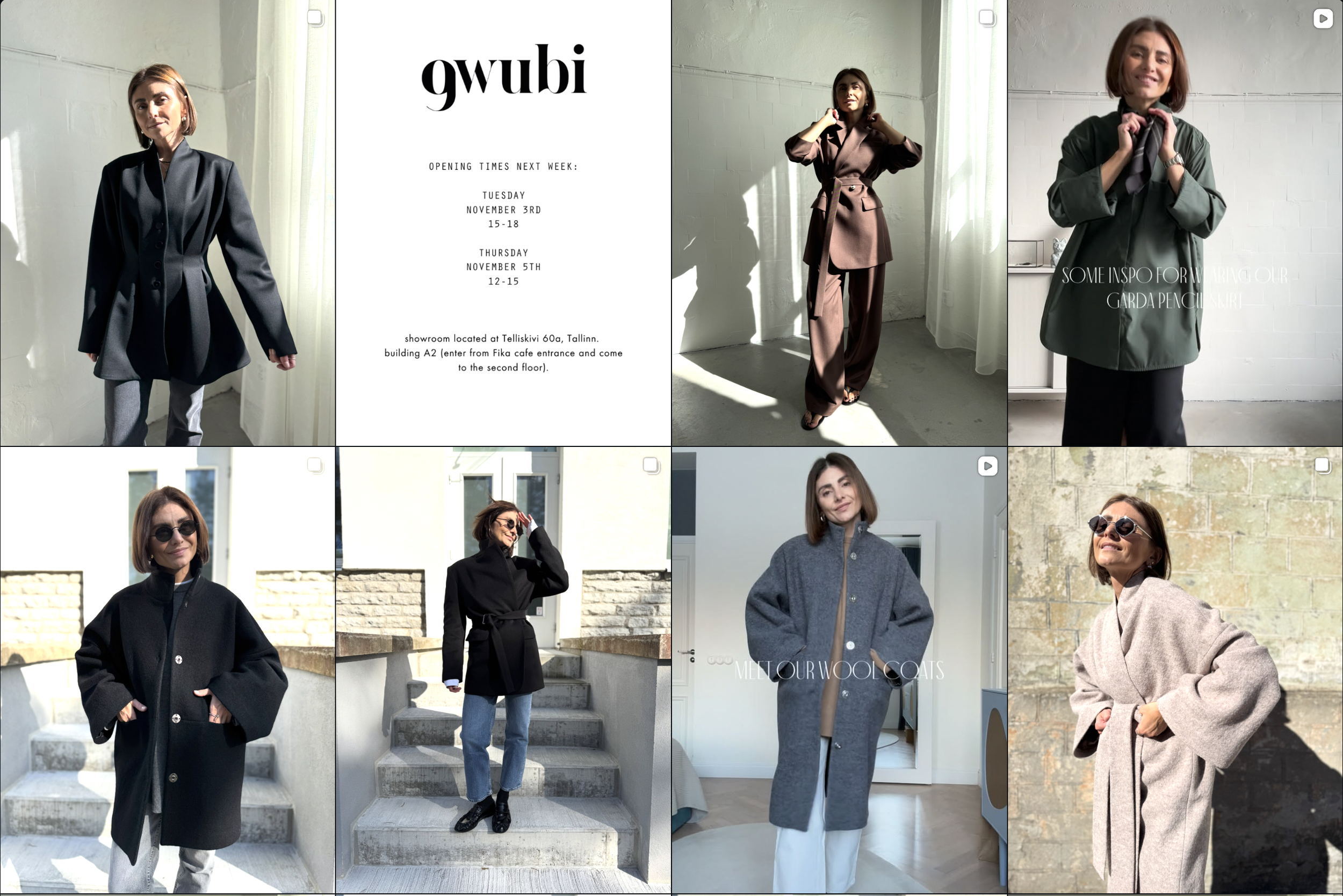
Gwubi Instagram feed
Be consistent with your Instagram colour palette
Consistency matters when you're building an audience on any social media platform, and Instagram is no exception.
Getting your Instagram colour palette right helps you build an audience who will not only engage with your photos but follow your account. Instead of collecting likes on one-off posts, you'll start to attract the audience you need to grow your business.
The next step is to create an Instagram strategy for your business. If you'd rather have help, our social media management team can build your look and run your account for you.Be consistent with your Instagram colour palette
Consistency matters more when building an audience on any social media platform, and this includes Instagram.
Getting your Instagram colour palette right will help build an audience who will not only engage with your photos but follow your account.
Instead of generating likes on your one-off Instagram posts, you will begin to attract the audience you need to boost business and engagement. The next step would be to create an Instagram strategy for your business.
-
Start with your brand colours and the feeling you want to create, then choose a palette type, such as monochromatic, analogous or neutral. Use a free tool like Adobe Color, Coolors or Canva to find matching shades, and keep it to four to six colours. Preview your grid before you post to check it looks consistent.
-
Four to six is plenty. A light neutral, a dark colour for text, your main brand colour and one or two accents give you enough variety while keeping your grid consistent.
-
Not exactly, however your edits should look consistent. Choose two or three filters or presets that suit your palette and use them across your posts, adjusting brightness or colour where a photo needs it.
-
It helps. When people visit your profile, they see your grid as a whole, so a consistent look makes your account appear professional and gives them a reason to follow. Your content still needs to be useful or inspiring, however colour is what makes the first impression.