Top banner design tips for captivating visuals
Are you looking to master banner design web that grabs attention and delivers results? Our guide dives straight into the essentials of banner design, covering size selection, visual hierarchy, and strategic placement to ensure your banners not only look great but also work hard to capture your audience. Get ready to turn these insights into action for your next campaign.
Key Takeaways
Effective banner design should prioritize selecting the correct size and strategically placing the ad for maximum visibility and user engagement while maintaining a clear visual hierarchy to guide the viewer’s attention.
The appeal of banners can be enhanced by simplifying content, using engaging calls to action, and creating a defined frame to focus the viewer’s attention. Animations and colours can also be incorporated appropriately to create captivating visuals.
Consistency and quality are crucial in banner design, requiring alignment with the brand image, optimal file format selection, and maintaining small file sizes for quick loading. Blu Mint offers flexible, expert-led design services to assist marketing teams.
Essentials of Web Banner Design
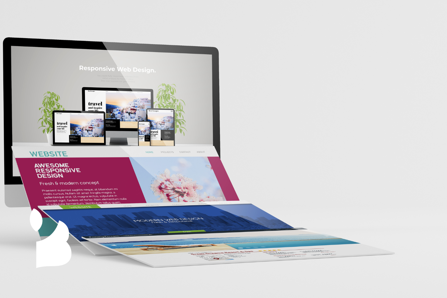
Navigating the world of digital marketing, the web banner is your visual ambassador, your silent salesperson, your online herald. Choosing the right banner size, placing it strategically, and maintaining visual hierarchy aren’t just design choices—they’re your secret weapons in the battle for customer attention.
Custom banners are essential for promoting businesses and communicating information about products or services. Their tailored designs and professional appearance make them a valuable tool for enhancing visibility and attracting new customers.
Whether you’re designing a website banner for a social media campaign or a website’s landing page, these elements are the building blocks of successful banner design.
Choosing the Right Banner Size
The right banner size is much like choosing the right outfit—it must suit the occasion and environment. The right banner size ensures your content is visible and well-presented across different platforms, including websites and social media. But it’s not a one-size-fits-all situation. Your selection should consider the specific goals of your advertising campaign and the variety of devices where the ad will be shown. Some common banner sizes to consider include:
300x250 pixels (medium rectangle)
728x90 pixels (leaderboard)
160x600 pixels (wide skyscraper)
320x50 pixels (mobile leaderboard)
970x250 pixels (billboard)
In addition to choosing the right size, utilizing web banner templates can enhance your website content through visually appealing designs. These templates offer ease of customization, allowing you to edit text, colors, logos, and images, and can be designed from any device using various design resources.
By choosing the appropriate banner size, you can maximize the impact of your advertising campaign and effectively reach your target audience.
Common banner ad sizes include:
468 x 60
728 x 90
970 x 90
320 x 50
These dimensions cater to different ad placement needs and device formats. But remember, it’s not about filling the space—it’s about seamlessly fitting your message into the viewer’s experience.
Strategic Banner Placement
If banner size is the outfit, then placement is the runway—the stage where your banner struts its stuff. Banners placed at the top of the page or along the left side are highly effective, aligning with users’ natural browsing behaviour. It’s like setting up a billboard on a busy highway—you want your banners to be in the line of traffic, readily visible to site visitors. Event banners are particularly effective for promoting social gatherings like trade shows, festivals, and corporate events, increasing visibility and creating brand awareness. Auf der Suche nach optimal banner placement, consider these factors to ensure maximum visibility and effectiveness, or explore other strategies to achieve your goals.
But don’t just set it and forget it. Regular testing of banner ad positions and content is crucial in identifying the configurations that maximize user engagement and conversion. It’s about finding the sweet spot where your banner can command attention and inspire action.
Maintaining Visual Hierarchy
Visual hierarchy is the compass that guides the viewer’s gaze across your banner. It highlights the most essential elements, such as the brand logo, value proposition, and call-to-action, ensuring they don’t get lost in the visual mix. A clear visual hierarchy captures user attention and effectively guides them towards the intended action.
Additionally, a well-structured visual hierarchy can help convey a brand's story, communicating the brand's identity and values through the design elements of the banner.
Creating this visual hierarchy involves the strategic use of tools such as:
Contrasting colors
Size variation
Mindful typography
Spacing
It’s about designing a roadmap for the eyes, ensuring the most critical content takes precedence. Employing a typographic hierarchy also helps manage the viewer’s attention and ensure readability by clearly distinguishing between various textual elements, like headlines and body text.
Enhancing Banner Appeal
Once you’ve nailed the essentials, it’s time to add some magic to your banners by making them eye-catching. This involves simplifying content and imagery, incorporating buttons and calls to action, and framing your banner.
These tricks of the trade can transform your banners from mere digital signage into the best compelling narratives that capture attention and inspire action, all with the help of a captivating bilder. By incorporating the right elements, you can bring your banners to life and make them truly stand out. One way to achieve this is by addressing your audience’s most pressing concerns, being covered, and being well-informed.
Simplifying Content and Imagery
In banner design, less is often more. Effective banners limit content to essential information, using straightforward imagery for rapid viewer processing. It’s about distilling your message to its most potent form, making it easy for viewers to grasp it in the blink of an eye.
Using your own images and unique brand assets can further enhance this simplicity by effectively communicating your brand's story. This customization allows businesses to create personalized banner designs that resonate with their identity.
For instance, a special offer or promotion should take centre stage in your banner design. When placed prominently within a simple design, it increases viewer attention and underlines the advertisement’s main message. It’s about making a strong impression quickly, so keep the focus on promoting your banner.
Incorporating Buttons and Calls-to-Action
Calls to action (CTAs) and buttons are the stars of your banner show. They guide viewers through the next steps, potentially improving engagement and conversion rates. Think of them as the directors of your banner narrative, guiding your audience towards the climax—clicking the button or responding to the call to action.
To create the perfect banner, it's essential to have all the necessary design elements, including templates, customization options, and a variety of design ingredients that allow you to tailor your banners to meet specific needs.
The CTA button is a vital component of a banner. It is typically situated in a spot where the eye naturally moves after seeing the logo and offers. Designed with contrasting colors, it stands out and encourages clicks. Adding a CTA button in the hero banner is crucial as it guides visitors towards taking immediate action, which can enhance conversion rates and direct user behavior effectively.
Creating a Defined Frame
A banner without a frame is like a painting without a canvas, lacking structure and focus. A defined frame in banner layouts concentrates the viewer’s attention and enhances the overall visual appeal. The boundary sets your banner apart from the surrounding content, giving it space to shine.
Using a banner template can provide the necessary structure and focus for your banner design. Creating this frame involves careful alignment and contrast. These design principles establish a defined frame that can effectively direct a viewer’s focus. It’s about creating a stage for your content to perform, ensuring that your audience’s eyes are drawn to the right places.
Utilising Animation and Colour
Now that we’ve framed the banner, let’s add some life. Animation and color are powerful tools for creating captivating visuals. But like all powerful tools, they must be used wisely. Too much animation overwhelms viewers, while the wrong colours create a visual cacophony.
Additionally, our banner templates come in different styles, catering to various needs and allowing you to create unique and effective designs.
Let’s dive into how to incorporate animation wisely and select appropriate colours.
Incorporating Animation Wisely
Animation is the pixie dust of banner design. It adds a sprinkle of magic, turning static images into dynamic stories. But like all magic, it should be used sparingly. Select animation effects that fit your brand’s personality, enhancing your ad’s character without overwhelming viewers.
Creating stunning banner designs is crucial for capturing attention, and collaborating with design tools like Canva can make this process easier. With numerous design templates available, both experienced designers and beginners can produce professional-quality banners effortlessly.
Keep your animations brief to maintain viewer engagement. Use effects like:
sliding
fading
bouncing
swinging
To add movement that matches your brand’s personality. Animate each element separately and ensure all animations are in sync for a cohesive viewing experience. And don’t forget to loop your animations, ensuring your ad’s message remains accessible over time.
Selecting Appropriate Colours
Colours are the emotional undertones of your banner design. They can evoke feelings, set the mood, and even influence decision-making. Colour choices in banner design can influence consumer decisions often within the first 90 seconds of viewing. That’s why it’s crucial to understand the emotional impact of colours on your target audience and consider the cultural significance of chosen colours.
Utilizing free banner templates can simplify the process, offering ease and customization options to create professional-looking banners that effectively communicate your brand identity and engage audiences across various platforms.
Using colours strategically can help emphasise your intended message and align with your brand identity. For example, vibrant colours, consistent brand palettes, and colour transitions or gradients can create visually engaging and attractive banners. And don’t forget to consider seasonal changes when choosing colours. A summer campaign might benefit from warm, vibrant hues, while a winter campaign might resonate more with cool, calming colours.
But remember, not everyone sees colours the same way. Ensure your banner designs are accessible and inclusive, especially for visually impaired individuals. Respect cultural diversity in colour perception to ensure your message resonates with a broad audience.
Ensuring Consistency and Quality
Quality and consistency are the twin pillars of effective banner design. They enhance brand perception and influence user interaction, leading to better conversion rates. Ensuring a high-quality visual presentation requires careful attention to detail, from presenting a unified brand image to selecting the right file formats and keeping file sizes small.
With the ability to design online, creating banners has never been more accessible and user-friendly. Online design tools offer a wide range of templates and customization options, making it easy for both beginners and experienced users to create professional-quality designs from any device.
Presenting a Unified Brand Image
Brand consistency is the hallmark of successful marketing. It establishes a strong reputation, differentiates your business in a competitive market, and fosters customer trust. In banner design, this means maintaining a consistent brand colour palette and incorporating your company logo prominently.
A lack of brand consistency can lead to a fragmented customer experience, causing confusion among consumers and potentially diminishing your brand’s perceived value. You can prevent misconceptions and maintain clear and consistent brand communication with your audience by ensuring a unified brand presentation across marketing assets, such as banners and landing pages.
Choosing the Right File Formats
Just as a painter chooses the right canvas for their masterpiece, you must select the appropriate file formats for your banners. This is essential for ensuring compatibility across different platforms and maintaining the quality of your visuals. The most commonly used formats in banner design are:
JPG
PNG
GIF
HTML5
Each format has its strengths:
JPG banners are highly compatible and ideal for conveying a message with a single, high-quality image.
PNG banners are suitable for high-quality images and logos with multilevel transparency.
GIF banners allow for dynamic advertising with multiple frames.
HTML5 banners offer great flexibility and cross-browser support, making them ideal for complex, animated ads.
Keeping File Sizes Small
In the fast-paced digital world, every second counts. That’s why keeping your banner file sizes under 150 KB is crucial. Large file sizes can slow down website loading times, leading to a poor user experience and potentially driving visitors away.
Reducing file size doesn’t mean compromising on quality. It means optimizing your images, minimizing the use of multiple images and text, and choosing the right file format. It’s about delivering a smooth, seamless experience to your viewers, wherever they may be.
Partnering with Blu Mint for Banner Design
Now that you know how to design captivating banners, it’s time to implement it. But you don’t have to do it alone. Blu Mint offers design services for ambitious marketing teams and flexible, reliable, and high-quality banner design services.
Frequently Asked Questions
-
Choosing the right banner size is crucial for ensuring your content is visible and well-presented across various platforms, such as websites and social media platforms.
-
To enhance the appeal of your banners, simplify content and imagery, use buttons and calls-to-action, and create a defined frame for a more impactful design.
-
To use animation effectively in your banner design, keep the animations brief and in line with your brand's personality to add a dynamic element to your banners.
-
Consistency and quality in banner design are important because they enhance brand perception, influence user interaction, and lead to better conversion rates.
-
Partnering with Blu Mint for banner design provides access to flexible capacity, daily cost overviews, and support from an experienced lead designer for quality coordination. This ensures a stress-free and efficient process for your design needs.